 What blog color should I choose for my new theme?
I have finally decided to take the plunge and change this blog to a Genesis Framework (I’ve already changed my detox blog) and am trying to decide on the best color for the new theme.
I have never really been happy with the color I have now. I never actually said to myself “I want a pink blog”! I had seen some blogs that I liked and tried to get the same color which was more of a red with pinkish hues but it didn’t turn out quite like that.
Everyone seems to have a preference when it comes to the color of their clothes, their car, and their homes but what about the color of your blog?
When you set up your blog did you know exactly what color you wanted? Did you do any research into it first?
Internet Marketing and Blog Color Psychology
Did you know that color is more than just personal preference? Color actually has a strong influence on your thoughts and feelings.
Ever had color therapy? I had a massage once that was combined with color therapy. I had to choose a colored oil. Guess what color I chose? Pink! Got to be somethng in that don’t you think?
I’m not sure what it did for me but I enjoyed the massage.
Color psychologists say that color is a powerful tool that can create emotion and behavior in just a fraction of a second, without stimulating any of your other senses.
In today’s world, almost all businesses have an online presence and consequently they have long been using blog color to elicit emotions from their buyers.
Just like store windows, the colors you use for your blog can apparently make a big difference to the success of your site.
If you want to attract your target market, it helps to know how certain colors can affect customer behavior.
If you are about to create your blog for your business, choosing the right color for your site is the most important decision that you have to make.
If you listen to what the the experts say your blog color could mean the difference between being able to catch your target market or not.
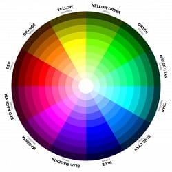
Choosing the Best Color for Your Blog
After some research into the subject it seems there is no singular best color for blogs, but the most commonly used is blue.
The three major social media platforms, which are Facebook, Twitter, and LinkedIn use the color blue.
And this isn’t just a mere coincidence. These sites use the color to elicit their brand image without using words.
Blue signifies authority, sincerity, trust, security, and intellect. It also has a relaxing and calming effect, making people want to stay longer in your site.
I have noticed that a lot of internet marketers choose blue for their blogs but I’m not sure if they base this on the psychology of color or not.
Red elicits a physical reaction from the body – it increases heart rate and stimulates the nervous system.
When viewers visit a red site they will experience a feeling of urgency, like they have to do something, since red stimulates the circulation of blood.
This color, surprisingly I think, is especially useful for food businesses as it increases appetite and for shopping, as it is best used for impulsive shoppers.
You can use this color on your Add to Cart or Buy Now button, to encourage your audience to buy.
Yellow is the brightest color and it is the first thing that people will see, whether they’re in a crowd or browsing through the net.
Yellow symbolizes cheerfulness, youthfulness and optimism. If you want to stand out from a crowd of other blogs online, use yellow.
Black is often used by websites that sell high end and luxurious products. Black symbolizes an air of mystery and secrecy, and can sometimes be intimidating, but it is very useful in giving a message of sophistication. If you’re in the business of luxury, then black is the best choice.
Personally. I hate blogs that are predominately black with white or grey text. I find them very difficult to read and a huge turn off. I leave immediately.
White is considered to be the best background color for blogs since it will make other colors pop out. Some popular internet marketing blogs I have seen use a mainly white theme. Orange signifies affordability but too much of it can be seen as cheap, so be careful when you use this color.
Purple – If you are in the creative field, purple is the best color for you, as it elicits feelings of fantasy and creativity.
If you want to know more about using color for business I found quite a lot of information here.
So what about Pink?
There is plenty about what it means if pink is your favorite color but actually it’s not. I did find this though:
“Even though pink is usually associated with femininity, it can appeal to males as well since it exudes kindheartedness, romance, and love. If yours is a feminine blog, then pink could be a perfect choice.”
According to some research done by analytics company KISSmetrics that can be applied to websites:
Women love: Blue, Purple and Green
Men love: Blue, Green and Black
Women hate: Orange, Brown and Gray
Men hate: Brown, Orange and Purple
So, both men and women love blue and green. Does this mean I should go for blue?
I had no problems choosing the color for my detox blog. Green is always associated with health so I went for green.
KISSmetrics also created this amazing infographic on the science of how colors affect our purchases.

I asked in a few Facebook Groups what they thought about the best blog color for an IM blog. Bradley Will of Learn To Blog said this:
“I’m not sure anyone knows what the best color is for a blog. It’s one of those things that you just need to test for a while and see if you get the results you want. Then test a different color and see if it improves things.
I’ve heard in the past that the blue that icontact.com uses is one of the best converting colors for sales pages… Not sure how it works for blogs though. It’s all an experimental process. Different people’s followers will respond to different elements and variations. No one can tell you for sure what will work best for you. It just takes testing.”
I think it would be a hard thing to test because other things on the blog will have changed by the time you change the color. You will have written more posts and you may have been doing more blog promotion and got more traffic.
Not sure where all this leaves me. I think I will be pondering this for a while yet.
And then there is the question of the header graphic. I thought it would be a bit of fun but I’m not so sure about it now. Do you think it’s too gimmicky?
Do you think there is a best blog color for an IM blog? Any tips? Share your story of how you chose your blog color in the comments.
Hi Adrienne,
One of the first things I noticed about your blog was that it was plain, simple and clean looking. Often best I think.
I am coming around to the idea of blue although I always felt it was boring as so many bloggers in the IM/MMO niche seem to go for blue. Whether they chose blue because they had heard it was a good color to choose for an IM blog I really have no idea.
I’m still looking at as many blogs as I can to get some ideas. I know I don’t want a pink blog that’s for sure!
Thanks for visiting and your insightful comment.
Sandy
Hi Sandy,
I used to have my blog in red and I was told to get rid of it because red is a stopper – this I was told by a so called professional.
So, I then changed my theme entirely and got a logo made and that’s what it’s been ever since.
I do agree with you – I don’t like blogs with an entire background of black – such a turn off. I think that they can work for musicians, though.
Normally I would not have thought about the colors for a blog as I basically just chose what I liked, not realizing the impact it could have on the visitors.
I found this post very intriguing and hopefully it will help those that either have never thought about their colors or for those looking to make the decision.
Linda
Hi Linda,
Interesting what you say about the red blog because a couple of UK marketers I know have blogs that are basically red. The theme you have now is very clear and clean and it does look good.
I never thought when I wrote this post that it would result in so much discussion.
Sandy
Hi Sandy
My favorite color is pink and next is turquoise. I have a blog for women that has some pink in it. My main site has some red and I have tried to make it look classy. I did put blue headers different times with different all around colors but have stuck with what I have now as I like the look. As long as it is easy to read the print, the rest will probably have very little to do with the color, unless the color is annoying or depressing. Such as in orange or black.
Mary
Hi Mary,
I think you may be right. The main thing is to have a blog that is easy to read and does not put people off with garish or weird color combinations.
Sandy
Color plays an important in not only your website but everything you do. When we had our logo redesigned I didn’t want to use too much red. So the G in Garrett Specialties is a red brush stroke. Red is power color but the brush stroke toned it down. We used mainly blue for the rest of the site for the accent color. I knew blue instills trust and confidence. There is a an old book that I read when I sold real estate. “Dress for Success”. It was about colors and how they effected people. When I wanted someone to buy a house I would wear fushia. Fushia is an annoying color so it would make them make a decision in a hurry. When I took a listing I would wear Blue as it would elude trust. When I went to the closing I would wear beige which is non threatening color. Color has played a big role in our psyche whether we realize it or not.
Hi Arleen,
I had forgotten about color for clothes. I went once for a color me beautiful consultation where I was advised what colors suited my skin tones. Interesting what you say about using clothes for your job. Did it work?
Sandy
Hi Sandy
I think colors are very important and they certainly can change the way you feel. Your colors look good.
Mostly with clothes, This season I have gone for lots of colors – whereas before I stuck to a lot of plain colors and always had a lot of blacks but now I have broken that mold.
To YOUR success
Sue
Hi Sue,
Color psychology is certainly big business. I heard about it many years ago when I was a nurse as they often painted hospital ward rooms in pale green as it was supposed to be a good color for healing and health as well as making people feel calm.
When it comes to clothes, I’ve always liked bright colors and I tend to go for horizontal stripes when it comes to tops. I’ve never been one for much black although I do have some long black dresses for dinner/dances. Not that I go to many of those these days.
Thanks for dropping by and taking the time to comment.
Sandy